 Quasar
Uploader
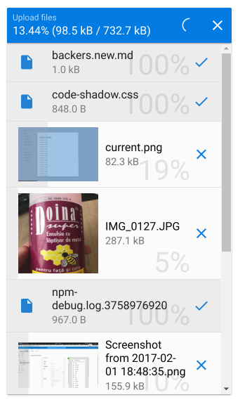
Quasar supplies a way for you to upload files through QUploader component.
Works well with QField for additional functionality such as a helper, error message placeholder and many others.
Installation
Edit /quasar.conf.js:framework: {
components: ['QUploader']
}
Basic Usage
<q-uploader :url="url" /> |
Vue Properties
| Vue Property | Type | Description |
|---|---|---|
url | String | (Required) URL or path to the server which handles the upload |
name | String | Name of the file, if it should be different than the file’s name. |
headers | Object | Specify what headers need to be added to the XHR request |
url-factory | Function | Function (with file object received as parameter) which returns a Promise that resolves to a URL. |
method | String | HTTP method to use (POST/PUT). Defaults to POST. |
extensions | String | Extensions to allow for uploading. Example: '.gif,.jpg,.jpeg,.png' |
multiple | Boolean | Allow multiple file uploads |
hide-upload-button | Boolean | Hides the Upload button. You can then trigger it manually by calling upload() on the Vue ref |
hide-upload-progress | Boolean | Hides the upload progress. Useful when you want some other means of signaling upload progress to the user. |
additional-fields | Array | Additional fields to send along the upload request. Useful for authentication and so on. Array of Objects containing name and value props. |
no-thumbnails | Boolean | Don’t display thumbnails when files are images. |
auto-expand | Boolean | Auto-expand the list of files when some are added to the queue. |
expand-style | String/Array/Object | Style of the expanded file list container. |
expand-class | String/Array/Object | Classes of the expanded file list container. |
send-raw | Boolean | Don’t use multipart/form-data and send the file content inside the request body. If using this approach you will need to specify the correct Content-Type header. Defaults to false. |
readonly | Boolean | If set to true, Uploader is displayed as read-only. |
clearable | Boolean | If set to true, the component offers the user an actionable icon to remove the current selection. |
Common input frame properties:
| Property | Type | Description |
|---|---|---|
prefix | String | A text that should be shown before the textfield. |
suffix | String | A text that should be shown after the textfield. |
float-label | String | A text label that will “float” up above the input field, once the input field gets focus. |
stack-label | String | A text label that will be shown above the input field and is static. |
color | String | One from Quasar Color Palette. |
inverted | Boolean | Inverted mode. Color is applied to background instead. |
inverted-light | Boolean | Inverted mode with a light color. Color is applied to background instead. |
dark | Boolean | Is QUploader rendered on a dark background? |
hide-underline | Boolean | Hides the bottom border. |
align | String | One of ‘left’, ‘center’ or ‘right’ which determines the text align within textfield. |
disable | Boolean | If set to true, Uploader is disabled and the user cannot change anything. |
error | Boolean | If set to true, the input fields colors are changed to show there is an error. |
before | Array of Objects | Icon buttons on left side of input frame. Read below more details. |
after | Array of Objects | Icon buttons on right side of input frame. Read below more details. |
Icon buttons
This section refers to before and after properties which can add additional buttons as icons to the textfield. Here is the structure of the two properties:{
// required icon
icon: String,
// required function to call when
// icon is clicked/tapped
handler: Function,
// Optional. Show icon button
// if model has a value
content: Boolean,
// Optional. Show icon button
// if textfield is marked with error
error: Boolean
}
Examples:<!--
Show an icon button (with 'warning' as icon)
-->
<q-uploader
:url="url"
:after="[
{
icon: 'warning',
handler () {
// do something...
}
}
]"
/>
Vue Methods
| Vue Method | Description |
|---|---|
upload() | Start file(s) upload. |
abort() | Abort uploading file(s). |
reset() | Reset uploader state. |
Vue Events
| Vue Event | Description |
|---|---|
@add(files) | Triggered when file is picked for upload |
@remove:abort(file) | Triggered when file is removed from upload queue while uploading. |
@remove:cancel(file) | Triggered when file is removed from upload queue before uploading. |
@remove:done(file) | Triggered when file is removed from upload list after it has been uploaded. |
@uploaded(file, xhr) | Triggered individually for each file that has just been uploaded |
@fail(file, xhr) | Triggered individually for each file that has encountered error while uploading |
@start | Triggered when upload has started |
@finish | Triggered when upload of file(s) has ended (with success or failure) |
Examples
AWS S3 - Uploading Using Pre-Signed URLs
<!-- |
async getSignedUrl (file) { |