 Quasar
Flex CSS
Quasar provides lots of CSS classes to help you build your UI easily with the help of Flexbox. Think of it like operating with rows and columns with many options at hand.
The final section of this page will show you how to create responsive UIs. Also take a look at the demo (best viewed by clicking “Desktop View” when on a desktop, because that’s where you can resize the window width to see helper classes in action). Click on “View Source” too to see the demo’s source code.
Background on Flexbox
The Flexbox Layout (Flexible Box) module (currently a W3C Last Call Working Draft) aims at providing a more efficient way to lay out, align and distribute space among items in a container, even when their size is unknown and/or dynamic (thus the word “flex”).
The main idea behind the flex layout is to give the container the ability to alter its items’ width/height (and order) to best fill the available space (mostly to accommodate to all kind of display devices and screen sizes). A flex container expands items to fill available free space, or shrinks them to prevent overflow.
Most importantly, the flexbox layout is direction-agnostic as opposed to the regular layouts (block which is vertically-based and inline which is horizontally-based). While those work well for pages, they lack flexibility (no pun intended) to support large or complex applications (especially when it comes to orientation changing, resizing, stretching, shrinking, etc.).
Getting Started
Quasar Flex CSS classes apply to either the Container (Parent) or the Container’s items (Children).


Parent Classes
Setting Direction
One of the following CSS classes is mandatory for the parent in order for the children ones (described in next sections) to have any effect.

| Class Name | Description |
|---|---|
row | Flex row |
row inline | Inline Flex row |
column | Flex column |
column inline | Inline Flex column |
row reverse | Flex row with flex-direction set to row-reverse |
column reverse | Flex column with flex-direction set to column-reverse |
Example:<div class="row">
<div>First column</div>
<div>Second column</div>
<div>Third column</div>
</div>
Wrapping by default
By default, all rows and columns are wrapping content.

However if you explicitly do not want to wrap and by so doing you want to fit all content into one line, then add no-wrap CSS helper class.
Also, if you want to wrap in reverse order, then reverse-wrap is available.
| Class Name | Description |
|---|---|
wrap | Wrap if necessary (“on” by default, no need to specify it) |
no-wrap | Do NOT wrap even if necessary |
reverse-wrap | Wrap backwards if necessary |
Alignment
For alignment along the main axis, use classes below. It helps distribute extra free space left over when either all the flex items on a line are inflexible, or are flexible but have reached their maximum size. It also exerts some control over the alignment of items when they overflow the line.

For alignment perpendicular to the main axis, use classes below. This defines the default behavior for how flex items are laid out along the cross axis on the current line. Think of it as the horizontal-* version for the cross-axis (perpendicular to the main-axis).

The next classes align a flex container’s lines within when there is extra space in the cross-axis, similar to how horizontal-* aligns individual items within the main-axis.

Children Classes
Distribution of Size
Quasar uses a 12 point column system for distributing size of row children. Here are some examples of the CSS helper classes available:<div class="row">
<div class="col-8">two thirds</div>
<div class="col-2">one sixth</div>
<div class="col-auto">auto size based on content and available space</div>
<div class="col">fills remaining available space</div>
</div>
In the example above, col-8 fills two thirds (2/3) of the row width, because 8/12 = 2/3 = 66%, while col-2 occupies one sixth (2/12 = 1/6 ~ 16.67%).
CSS helper class col-auto makes the cell fill only the space it needs to be rendered, with the possibility to shrink when not enough space is available. col, on the other hand, tries to fill all space available while also shrinking if needed.
Another example with a visual representation below it:<div class="row">
<div class="col">1</div>
<div class="col">1</div>
<div class="col">1</div>
<!--
we have 3 children, so equivalent
to above would be to use `col-4`
on each of the children
-->
</div>
<div class="row">
<div class="col-3">1</div>
<div class="col-6">2</div>
<div class="col-3">1</div>
</div>

There’s also the possible to offset a cell. Example: offset-4 which offsets a third of space (4/12 = 1/3 = 33%).
Wrapping
Wrapping is a key feature in understanding Flex CSS classes. You are not bound to use exactly 12 points per row. You can use less or even more.
This allows you, among other things, to dynamically stack rows vertically on smaller screens while displaying them on a single line on bigger screens. Read “Responsive Design” section.<div class="row">
<div class="col-2">...</div>
<!-- 2 + 6 < 12, so next element is placed on same line -->
<div class="col-6">...</div>
<!-- 2 + 6 + 10 > 12, so next element wraps to next line -->
<div class="col-10">...</div>
<!--
10 + 3 > 12, so next element wraps to next line.
Note that we take into consideration the current line only
(with col-10 only, since it was wrapped to its own line).
-->
<div class="col-3">...</div>
</div>
Note that rows are wrappable by default. Should you wish to disable this, use
no-wrapCSS helper class.
Self Alignment
An item can override the aligned specified on parent. This allows alignment to be overridden for individual flex items. Please see the Alignment explanation from Parent Classes to understand the available values (self-start, self-center, self-baseline, self-end, self-stretch).

Order
You can set the order of children elements by using order-first and order-last CSS helper classes.
By default, flex items are laid out in the source order. However, the order property controls the order in which they appear in the flex container. If you need more granularity, use order CSS property and assign the desired value.
Example:<div class="row">
<div style="order: 2">Second column</div>
<div class="order-last">Third column</div>
<div class="order-first">First column</div>
</div>
Here is how the CSS order property works:

Responsive Design
Flex CSS Helper classes can be applied based on the width of the screen, to help you in making a responsive UI. The 12 points grid is inspired by Bootstrap’s, so there are a lot of similarities.
What we’ve learned so far is that, for example, we can size the columns regardless of window width. If we are to create a response UI, we need to dynamically change the sizing while taking into account how wide the window is. First, let’s learn about some tokens that you can inject at middle of col-*, offset-* and col-auto helper classes (look at table below for tokens).
| Token | Max window width | Description / When it applies |
|---|---|---|
xs | 576px | Extra small sized window |
sm | 768px | Small sized window |
md | 992px | Medium-sized window |
lg | 1200px | Large sized window |
xl | Infinite | Extra large sized window |
Example: col-md-7, offset-lg-3, col-xs-auto.
Before diving into examples, make sure you read and understood Children Classes > Wrapping because it is key to understanding how you can build a responsive design.
A full example: let’s say we have a row with three children. On extra small windows, we need to stack the children vertically, on small windows we need to display them side by side (each having equal width), and starting with medium windows we should display them all on same line:<div class="row">
<div class="col-xs-12 col-sm-6 col-md-4">
col
</div>
<div class="col-xs-12 col-sm-6 col-md-4">
col
</div>
<div class="col-xs-12 col-sm-6 col-md-4">
col
</div>
</div>
Notice in the above example that we used col-xs-12 (12/12 = 100% of row, so each child will take full width of the container making all children stack vertically, since rows are wrapping content by default), col-sm-6 (6/12 = 50% of row) and col-md-4 (4/12 = 33% of row).
Like previously mentioned, rows wrap content by default, so when 12 (or more) grid points are used for a row, content is wrapped to the next line. If we have two <div>s and we use col-8 on both, they will also stack, since 8 + 8 = 16 and we can only display 12 points on a single line.<div class="row">
<!--
more than 12 grid points together,
so second <div> will wrap on next line
-->
<div class="col-8">col</div>
<div class="col-8">col</div>
</div>
Also check CSS Helpers > Visibility page to see thresholds on window width and these tokens (xs, sm, md, lg, xl) used on their own to hide or show DOM elements.
Customize breakpoints
If you want to customize existing responsive breakpoints or add new ones, you can edit the $size Stylus variable:$sizes = {
xs: 0,
sm: 575px
md: 767px
lg: 991px
xl: 1199px
}
Using Gutters
There are 5 types of gutter, depending on the amount of space that you want between your elements:
| Class Name | Size | Description |
|---|---|---|
gutter-xs | 8px | extra small gutter |
gutter-sm | 16px | small gutter |
gutter-md | 32px | medium gutter |
gutter-lg | 48px | large gutter |
gutter-xl | 64px | extra large gutter |
Let’s look at a basic example. Please take note of the structure. You need a wrapping <div> and your content must be inside the <div> which has col-* CSS helper classes. The gutter classes make use of negative margins, so if your flex grid content is contained within, for example, a q-collapsible with a clickable area immediately above the flex grid, you must specify class="overflow-hidden" to avoid the contents overlapping the active area of the parent component.<!-- Example with extra small gutter and two equal width cols -->
<!-- wrapping <div> required -->
<div class="overflow-hidden">
<!-- the row with a type of gutter -->
<div class="row gutter-xs">
<div class="col-6">
<!-- Your content here -->
</div>
<div class="col-6">
<!-- Your content here -->
</div>
</div>
</div>
IMPORTANT
Some components have default margins, like the form components. This will add to the gutter, which is probably not what you want. For such cases, useno-marginclass on those components, like in the example below:
<div class="overflow-hidden"> |
By default, the gutter applies both horizontally and vertically. If for example you different levels of gutter only horizontally or only vertically, use gutter-x-* and gutter-y-* CSS classes:<!-- small gutter horizontally, large gutter vertically -->
<div class="overflow-hidden">
<div class="row gutter-x-sm gutter-y-lg">
<div class="col-6">
<q-input v-model="model" class="no-margin" />
</div>
<div class="col-6">
<q-input v-model="model" class="no-margin" />
</div>
</div>
</div>
QInput Example
Let’s say we want to build something depicted in the two picture below.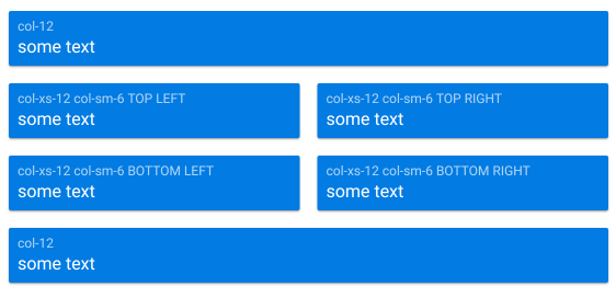
… which becomes like below on xs windows: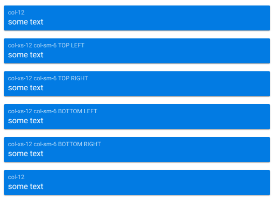
The template for this would look like below. Note we are using no-margin CSS helper class for QInputs to not add additional space to gutter.<div>
<div class="row gutter-sm">
<div class="col-12">
<q-input inverted v-model="model" class="no-margin" float-label="col-12" />
</div>
<div class="col-xs-12 col-sm-6">
<q-input inverted v-model="model" class="no-margin" float-label="col-xs-12 col-sm-6 TOP LEFT" />
</div>
<div class="col-xs-12 col-sm-6">
<q-input inverted v-model="model" class="no-margin" float-label="col-xs-12 col-sm-6 TOP RIGHT" />
</div>
<div class="col-xs-12 col-sm-6">
<q-input inverted v-model="model" class="no-margin" float-label="col-xs-12 col-sm-6 BOTTOM LEFT" />
</div>
<div class="col-xs-12 col-sm-6">
<q-input inverted v-model="model" class="no-margin" float-label="col-xs-12 col-sm-6 BOTTOM RIGHT" />
</div>
<div class="col-12">
<q-input inverted v-model="model" class="no-margin" float-label="col-12" />
</div>
</div>
</div>